Case study 16 / 17
UX/UI & Product Design
Fashion app UX/UI design: Dress Me Up
- Client
- Dress Me Up
- My role
- UX/UI design and research (16-week university project)
- Timeframe
- 2020
- Discipline
- Fashion tech · Mobile app · Prototype
- Survey responses
- 100
- Tailor and designer interviews
- 8
- Would pay extra for tailored suggestions
- 78%
- Weeks
- 16
From the published Dress Me Up case study.
(01) The short version
The short version
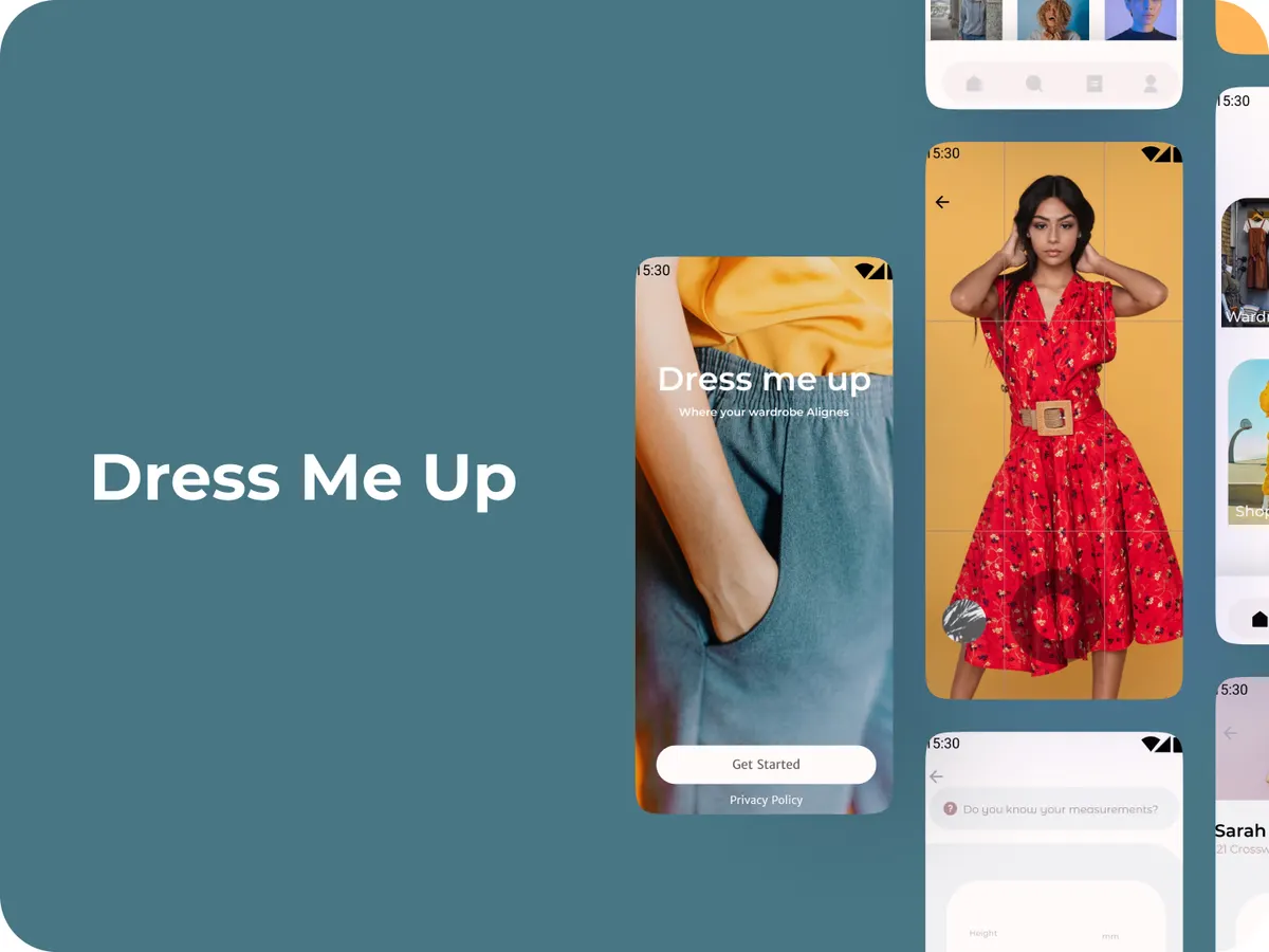
Dress Me Up was a 16-week project in my business degree: a fashion app that suggests outfits that fit your style and lets you chat directly with tailors to adjust them. We researched with real shoppers and tailors, then built a prototype that made a simulated AI feel personal. It never launched.
(02) The situation
The situation
Online clothes shopping means endless scrolling, decision fatigue and settling for “good enough.” Broad filters and “if you like X” suggestions weren’t cutting it, and nobody offered tailored advice plus an easy route to custom fittings.
We had 16 weeks, no real AI backend, and two very different users to design for: shoppers who want inspiration, and tailors who want clear custom orders.
(03) What I designed
What I designed
- 1
A 60-second style quiz
Visuals and sliders so people could show their taste in under a minute.
- 2
A look board demo
A rule-based demo showing how the app could narrow hundreds of items into a short, curated selection.
- 3
In-app designer chat
Ask for a different lining, share measurements and see mock-up previews, without email back-and-forth.
(04) What happened
What happened
Research came first: 100 survey responses from adults who shop for fashion online, 8 interviews with independent tailors and designers, and an audit of 5 competing apps.
78% of respondents said they’d pay extra for suggestions that felt made for them. Every tailor wanted a simple intake form and a chat window. Shoppers gave up after three clicks if nothing spoke to them. The prototype was designed around those three findings.
(05) What I’d tell you
What I’d tell you from this one
Real research plus a lean prototype shows you the hard problems before anyone writes production code. It also proved a good story can make a fake AI feel surprisingly real.