Case study 14 / 17
UX/UI & Product Design
Utility app UX/UI design: MegaLit
- Client
- MegaLit
- My role
- Lead UX/UI designer
- Timeframe
- 2021–2022
- Discipline
- Utilities · Mobile + web app · Accessibility
(01) The short version
The short version
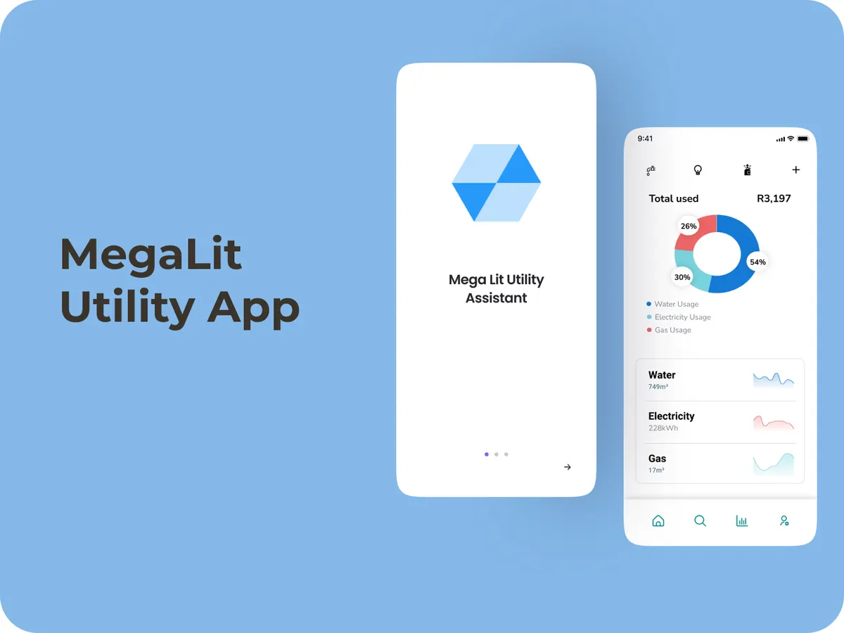
MegaLit was a utility app for Johannesburg residents tired of inaccurate water meter readings and painful bill payments. As lead UX/UI designer, I designed real-time meter readings, simple in-app payments and usage analytics, built to work for people with any level of tech confidence. It didn’t reach full launch.
(02) The situation
The situation
Residents dealt with inaccurate and delayed water meter readings, which led to billing disputes, and a payment process clunky enough to put people off paying on time.
Any fix also had to work for people with limited tech experience, not just the confident app users.
(03) What I designed
What I designed
- 1
Real-time readings
Up-to-date meter readings to replace delayed manual ones.
- 2
Simple bill payment
View and pay bills inside the app through a secure payment gateway.
- 3
Usage analytics
Consumption over time, so residents could see and manage their usage.
- 4
Inclusive by design
An accessible interface for every level of digital skill, available as both a mobile app and a web app.
(04) What happened
What happened
The work covered user research, task flows, information architecture, wireframes and final designs. The app didn’t reach full launch.
From the published MegaLit case study.
(05) What I’d tell you
What I’d tell you from this one
Designing for people who don’t trust the system yet means showing your working. A number on a bill is a dispute. A number with a reading history behind it is an answer.