Case study 15 / 17
UX/UI & Product Design
Emergency app UX/UI design: Hlomo
- Client
- Hlomo
- My role
- Co-founder, strategist, UX/UI designer and front-end developer
- Timeframe
- 2022
- Discipline
- Safety · Mobile app · Concept
(01) The short version
The short version
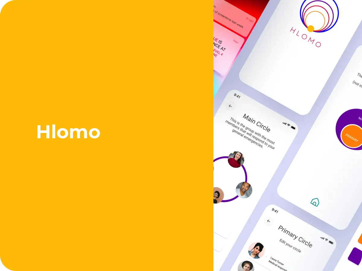
Hlomo was a concept to rethink emergency response in South Africa using trusted community networks. Over seven months at Sammi Studio, I co-founded it and handled strategy, UX/UI design and front-end development. The idea: one tap alerts neighbors and professional responders at the same time, through a calm, simple interface.
(02) The situation
The situation
Calling for help shouldn’t need a manual. The existing call center system is hard to navigate in a high-stress moment.
Vulnerable groups, including older people, refugees and people with disabilities, often struggle with jargon or poor network coverage. And people need to trust that an SOS will actually reach someone, fast.
(03) What I designed
What I designed
- 1
A single-tap SOS
A bold button that works offline and confirms clearly once the alert is sent.
- 2
An emergency circle
Pre-selected trusted contacts and organizations, set up before you ever need them.
- 3
Dual notifications
Neighbors and responders alerted together, with clear icons and color cues.
- 4
Cash and cashless options
So anyone can respond, whatever payment method they use.
(04) What happened
What happened
The concept came from secondary research and empathy mapping, then went into Figma designs. It was never tested with real users, and I’m upfront about that.
From the published Hlomo case study.
(05) What I’d tell you
What I’d tell you from this one
When someone is panicking, fewer taps and clear feedback beat any clever feature. Offline fallbacks and retry cues aren’t extras. A calm palette and short words matter more than you’d think.